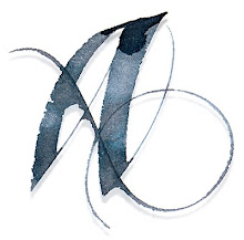
The Magic of Vitaly Shapovalov
One challenge all calligraphers face at some point is how to successfully integrate text and image. Calligraphy tends to be such a strong visual force that combining it with images often leads to dissonance between the image and text. I remember once picking up a book about calligraphy and flowers, only to marvel at how calligraphy and flowers can clash!
But, along comes Vitaly Shapovalov — a Russian calligrapher, illustrator and graphic designer who makes it look oh-so-natural. His calligraphic style is fluid and he adjusts the contours to reflect to the content of his illustration. He has been posting his work on facebook, and admiring calligraphers from around the world are taking note. Just when we think we've seen it all, he posts another album of his work and we are blown away again! Enough from me, here is some of his work (double-click on image to see larger):


Vitaly is actively involved in Russia’s International Exhibition of Calligraphy, and more of his work can be seen here.


7 comments:
Absolutely stunning! Very inspiring! Thanks for the post.
Great and different work!!
Thanks for keeping the promise Alice! good to see you :)
It's amazing how integrated the text is with the work...I'm not distracted by the words at all!
Beautiful :)
www.ashtreedesign.blogspot.com
Simply beautiful! Everything about it appeals to me. The colors are stunning as is the lettering. Just wonderful!
Amazingly creative! Thanks for posting.
Wow! That is very beautiful work. I got into Calligraphy myself a few years back but have never thought of it as a way of creating pictures.
His choice of colours fits with his writing as it does not overpower it.
Thanks for sharing this, will check the artist out.
Rich
These are beautiful! Can't decide if it makes me want to rush to my studio or despair forever!
Post a Comment