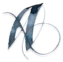
Reading Ondaatje

Acrylic on Canvas – 36" x 24".
What motivates calligraphers? At least one part is a love of words and reading. One of my favorite authors is Michael Ondaatje. When I first read The English Patient, years ago, I was mesmerized. Passages of it keep drawing me back and coming to mind when I have a pen in my hand.
This paragraph begins “And all the names of the tribes, the nomads of faith who walked in the monotone of the desert and saw brightness and faith and colour...” and further on, this starkly beautiful sentence: “We die, containing a richness of lovers and tribes, tastes we have swallowed, bodies we have plunged into and swum up as if rivers of wisdom, characters we have climbed into as if trees, fears we have hidden in as if caves...”
Yet, to attempt to interpret a piece of prose as calligraphy is daunting: does the calligrapher have anything to add to something already wonderfully written?


5 comments:
A really beautiful piece, Alice! Hmm. Don't be surprised if you start seeing some "paint like Alice" blog posts over my way ... :) I'd like to try exploring your brand of design, as far as that's possible for another person to do.
Thanks, Beth. I do hope you're inspired... but I would encourage you to find 'your own brand' ... you've got the talent, and there's tons of exploration yet to be done in fine art/calligraphy. (No imitations, please:) You can nick one little element, but use it your way! Having said that, I encourage you to explore acrylic on canvas, which gives lots of power to traditonal calligraphy, and allows for expansive spaces and sizes. Cheers!
Oh, I don't really mean copy, of course. The other night I went to an art opening in which I have a couple of pieces and saw that mine were the smallest pieces in the show. I'm thinking acrylic on canvas would encourage a bigger scale and more gestural elements. I don't think that would translate as imitation, though. But your pieces are instructive as to how small translates -- or mutates -- to larger. I'm really enjoying your blog.
Yes, I know exactly what you mean. I went through the same process of seeing my work appear small... and since calligraphy is a one-shot deal, it makes sense to start small until your technique is pretty solid. Russ Willms, a fellow painter (see post on José Parla) helped me understand the impact of size. FYI, I paint an acrylic background, sometimes glaze with Golden Soft Gel Gloss for a smoother surface, and write with FW or Ziller acrylic inks in my parallel pen.
Interestingly, each colour of acrylic paint creates a slightly different writing surface - just a little challenge to keep us awake :) If you have any other questions, send me an email. And yes, go big!
Absolutely gorgeous Alice! As is all your work. Power to your pen my girl!
Blessings, Sue x
Post a Comment