skip to main |
skip to sidebar


Calligraphy Information
Calligraphy Studies
Calligraphy Websites
- Australia | Dave Wood
- Australia | Gemma Black
- Belgium | Brody Neuenschwander
- Belgium | Yves Leterme
- Canada | Kathy Guthrie
- Canada | Martin Jackson
- France | Laurent Pflughaupt
- France | Michel D’Anastasio
- France | Sophie Verbeek
- Ireland | Denis Brown
- Italy | Chen Li
- Russia | Vitaly Shapovalov
- Slovenia | Loredana Zega
- USA | Annie Cowie
- USA | John Stevens
- USA | Julian Waters
- USA | Thomas Ingmire
Calligraphy Blogs
- Australia | Calligraffia
- Australia | Gemma Black
- Australia | Rhonda Ayliffe
- Canada | Francie Bredeson
- Canada | Lorraine Douglas
- France | Malika Boustol
- Germany | Peter Unbehauen
- India | Nikheel Aphale
- Iraq | Malik Anas Al-Rajab
- Japan | Ikuko Asami
- Jordan | Imbrahim Abu-Touq
- South Africa | Andrew van der Merwe
- UK | Sue Simpson
- USA | Beth Lee
- USA | Cari Ferraro
- USA | Louis Lemoine
- USA | Randall Hasson
- USA | Roann Mathias
- USA | Sharon Zeugin
- USA | Teri Martin
- USA | Victoria Pittman
Calligraphy Supplies
Things that matter
Labels
- Abstract Acrylics (11)
- Alice Koeth (2)
- Brody Neuenschwander (3)
- Calligraphy Guidelines (1)
- Cedar Brush (2)
- Cheerio Calligraphy Retreats (5)
- Commissions (2)
- Copperplate (1)
- Denis Brown (5)
- Edmonton Calligraphic Society (1)
- Fairbank Calligraphy Society (1)
- Fraktur (1)
- Fred Salmon (2)
- French Calligraphers (1)
- Georgia Angelopoulos (1)
- Ikuko Asami (1)
- Island Magic 07 (4)
- John Neal Booksellers (1)
- Kathy Guthrie (2)
- Letter Arts Review (2)
- Lorne Loomer (1)
- Lorraine Douglas (1)
- Malik Anas Al-Rajab (3)
- Martin Jackson (2)
- Personal (2)
- Pilot Parallel Pens (7)
- Polyrhythmic Calligraphy (2)
- Ruling Pen (1)

About Me

- Alice Young
- Calligrapher, artist & designer located on Vancouver Island, British Columbia, Canada. Bio/Statement


3 comments:
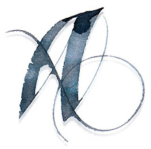
Thank you for the illustration. However, the drafting film makes the lettering rather pale. I think you have to use rather bright colours to make a pleasant effect. Actually drafting film makes a gray background and even the underlaying lettering will fade, simultaneously acquiring a grey shade.
Personally, I love the muted greys that this process produces. But you are right, Quelle, the drafting film gives everything a grey cast ... we also discussed how to get get the full tonal range in a piece of work, which would be a challenge if you were creating a finished piece with this technique.
This was a classroom exercise - in Denis' ‘real’ work, he uses layers of glass... so the layers are fully transparent, and colours brilliant. The purpose of the exercise was to demonstrate how to build up texture through layering.
Post a Comment